
Why Your Instagram Still Feels Off (Even When Your Grid Looks Good)
Here's a scenario I see constantly: someone has a genuinely beautiful grid. Good composition, cohesive color story, professional photos. And it still feels... off. Disconnected. Like something's missing that no amount of grid-planning fixes.
Here's why: composition without identity is just noise. A gorgeous grid built on top of an undecided brand is still an undecided brand — it's just a better-dressed version of the same problem.
The reason your grid feels inconsistent usually isn't a design problem. It's that you haven't actually decided who shows up.
Once that's decided, composition becomes the expression of that decision — not a substitute for making it. So let's talk about both: the identity decision that has to come first, and the composition techniques that bring it to life once it's made.
Deliberate composition is key to an Instagram glow-up
There are two important parts to consider when it comes to composition on your social feeds:
The composition of the individual pieces of content you're making
Your overall grid composition
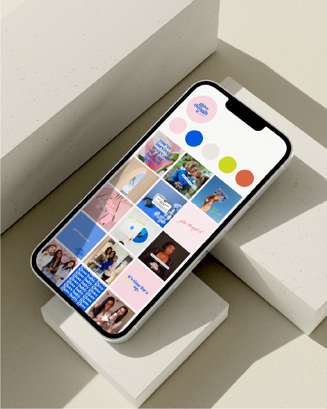
To create something brand-f'in-tastic, you'll have to play around with a variety of composition styles. When you do this, your overall grid composition tells a story and conveys a particular aesthetic, while each individual asset supports the overall narrative through different types of engaging content — which is exactly what keeps people scrolling.
But none of this works as a substitute for identity. Composition is how a decided brand shows up consistently — not how an undecided one fakes consistency.

Image styles you can use to create an engaging narrative
Finding your perfect mix helps hold your dreamy client's attention and creates a natural road map for content planning. Here's a list of image styles that plug into one another to create a seamless overall composition:
Flat Lays — top-down shots of thoughtfully arranged items. Great for portfolio work that wants a lifestyle feel, giving your audience a peek behind the scenes.
Portraits — vertical orientation, and literal portrait photography. A favored format on Instagram and Pinterest, and a great way to bring humans (and warmth) into your story.
Close Ups — zoomed-in, tight shots that capture the important details and invite your audience into an intimate moment.
Landscapes — horizontal, wide shots great for capturing big moments, transformations, or larger concepts.
Selfies — not for every brand, but for some, a huge opportunity to connect through casual, authentic photography. Decide what's true for your brand before you commit.
Digital Graphics — assets built in a design program are one of the best ways to drive brand recognition, showing off your fonts, palette, and other visual signatures.
Thoughtful composition helps keep your content interesting
Nailing your composition helps you build a grid that flows better, creates consistency, tells a strong story, makes a good first impression, and delivers the branded experience your dreamy clients actually respond to.
Here's what's next: audit your current feed. What's working? What's not? Then think about the composition you want to achieve and start planning content around it — based on your brand strategy (the decided one), your budget, and your posting cadence.
Composition is just one chapter of what I break down inside BrandShift Method — because a branded grid doesn't have to feel painful once the identity underneath it is actually decided. Learn more.
Read more:










Raising your rates isn't just about increasing your revenue. It's about buying back your time. When you charge more, you can reach the same income goal with fewer clients, fewer projects, and less capacity tied up in client work. This post explores the real reason to raise your rates and how better pricing can create more room for the life and work you actually want.